03 — ARTWORK
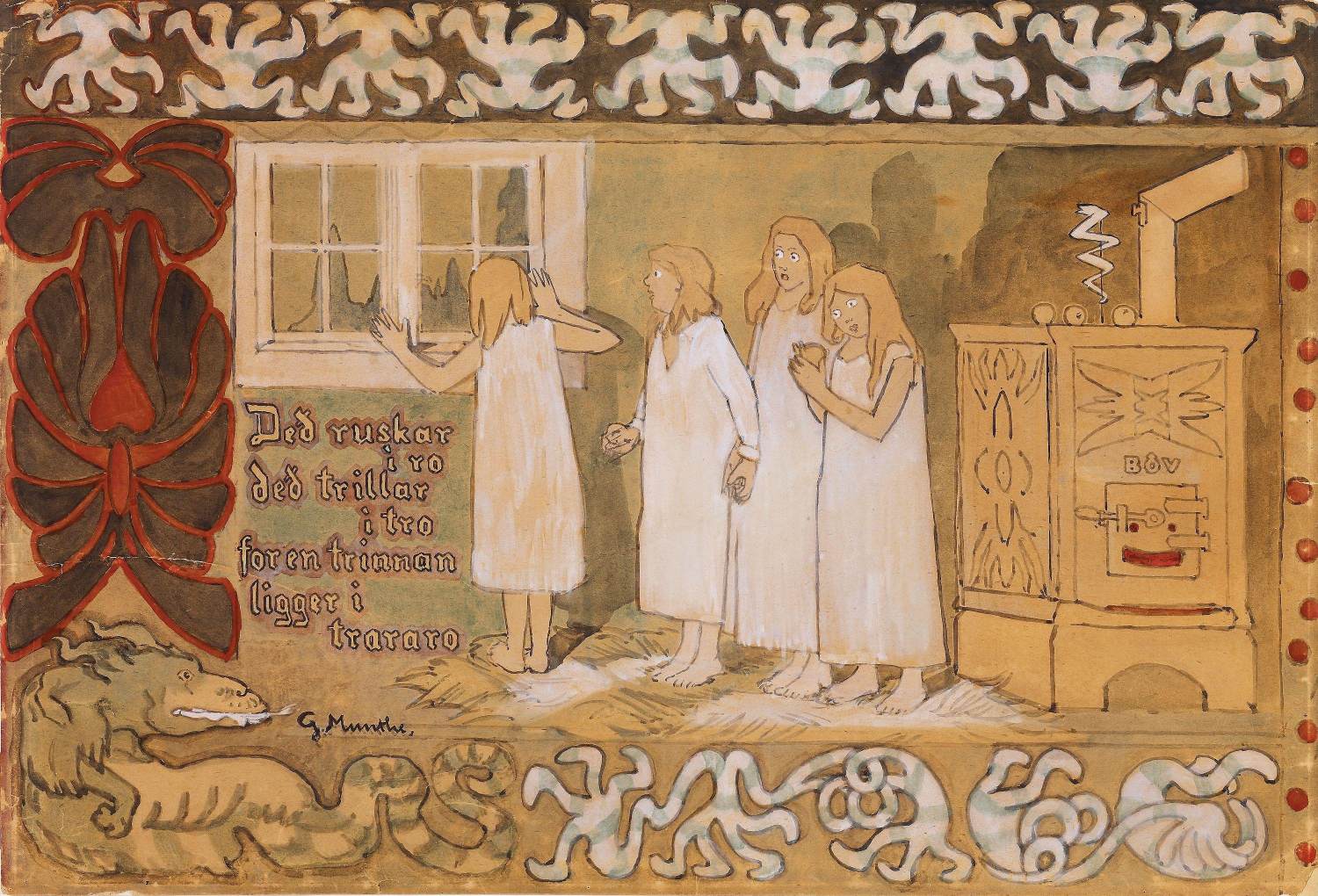
Mørkredd (Afraid of the Dark)
- MEDIUM
- Brush, watercolour and gouache on paper, 554 x 812 mm
- TYPE
- Other
PALETTE
HOVER OR TAP A SWATCH FOR NAME, SHARE AND HEX. SAMPLED FROM THE IMAGE — INDICATIVE, NOT A PIGMENT ANALYSIS.
DEVELOPMENT BUILD — NOT FOR PUBLIC USE. CONTRIBUTE ON GITHUB.
03 — ARTWORK
PALETTE
HOVER OR TAP A SWATCH FOR NAME, SHARE AND HEX. SAMPLED FROM THE IMAGE — INDICATIVE, NOT A PIGMENT ANALYSIS.
COMMENTARY
UNDERLINED TERMS ARE DEFINED IN THE GLOSSARY.
Mørkredd (Afraid of the Dark) c. 1892 Brush, watercolourPigment ground in gum, usually gum arabic, and applied with brush and water to a painting surface, usually paper; the term also denotes a work of art executed in this medium. The pigment is ordinarily transparent but can be made opaque by mixing with a whiting and in this form is known as body colour, or gouache; it can also be mixed with casein, a phosphoprotein of milk. Watercolour compares in range and variety with any other painting method. Transparent watercolour allows for a freshness and luminosity in its washes and for a deft calligraphic brushwork that makes it a most alluring medium. There is one basic difference between transparent watercolour and all other heavy painting mediums - its transparency. The oil painter can paint one opaque colour over another until he has achieved his desired result. The whites are created with opaque white. The watercolourist's approach is the opposite. In essence, instead of building up he leaves out. The white paper creates the whites. The darkest accents may be placed on the paper with the pigment as it comes out of the tube or with very little water mixed with it. Otherwise the colours are diluted with water. The more water in the wash, the more the paper affects the colours; for example, vermilion, a warm red, will gradually turn into a cool pink as it is thinned with more water. The dry-brush technique - the use of the brush containing pigment but little water, dragged over the rough surface of the paper - creates various granular effects similar to those of crayon drawing. Whole compositions can be made in this way. This technique also may be used over dull washes to enliven them. and gouacheGouache is opaque watercolour, known also as poster paint and designer's colour. It is thinned with water for applying, with sable- and hog-hair brushes, to white or tinted paper and card and, occasionally, to silk. Honey, starch, or acrylic is sometimes added to retard its quick-drying property. Liquid glue is preferred as a thinner by painters wishing to retain the tonality of colours (which otherwise dry slightly lighter in key) and to prevent thick paint from flaking. Gouache paints have the advantages that they dry out almost immediately to a mat finish and, if required, without visible brush marks. These qualities, with the capacities to be washed thinly or applied in thick impasto and a wide colour range that now includes fluorescent and metallic pigments, make the medium particularly suited to preparatory studies for oil and acrylic paintings. It is the medium that produces the suede finish and crisp lines characteristic of many Indian and Islamic miniatures, and it has been used in Western screen and fan decoration and by modern artists such as Rouault, Klee, Dubuffet, and Morris Graves. on paper, 554 x 812 mm Nasjonalgalleriet, Oslo
After 1892 Munthe produced some decorative watercolours in the tradition of European Art Nouveau, a series of 'fairy-tale moods' intended to appeal to the viewer's subconscious and depict subjects that could not be expressed through a naturalistic approach. The style was based to some extent on old Norwegian art, mainly peasant rugs from the 18th century, but Munthe was also influenced by the work of modern French painters such as Pierre Puvis de Chavannes and Paul Gauguin. There are literary allusions to medieval Norwegian folk poetry and the work of the Belgian Symbolist poet and dramatist Maurice Maeterlinck. PerspectiveThe method of representing three-dimensional objects on a flat surface. Perspective gives a picture a sense of depth. The most important form of perspective in the Renaissance was linear perspective (first formulated by the architect Brunelleschi in the early 15th century), in which the real or suggested lines of objects converge on a vanishing point on the horizon, often in the middle of the composition (centralized perspective). The first artist to make a systematic use of linear perspective was Masaccio, and its principles were set out by the architect Alberti in a book published in 1436. The use of linear perspective had a profound effect on the development of Western art and remained unchallenged until the 20th century. is discarded, and firm, curved outlines surround areas of strong and unmixed colours. The colours are used to evoke particular moods and were also chosen as seeming typically Norwegian.
His first series of watercolours, exhibited in 1893, included the Horse of Death, Afraid of the Dark and the Daughters of the Northern Lights and their Suitors (all National Galleryan upper story, similar to a tribune, running along the side of a building and open on one side to the interior; in a church (basilica) above the side aisles, over the ambulatory (central-plan building) and also over the west end. The gallery was used to keep certain groups of worshippers apart (women, noblemen)., Oslo). Some of these compositions were subsequently made into designs for tapestryAs historical climatologists have not shown that Renaissance Italian winters and springs were warmer than they are now, it is puzzling that Italy did not fabricate tapestries to decorate and draught-proof the stony rooms of its palaces until 1545, when Cosimo I set up a manufactory in Florence. To hardiness or stinginess (tapestry was by far the most expensive form of wall decoration) we owe the existence of such secular frescoed decorative schemes as the labours of the months in the castle at Trent (c. 1407), the Arthurian scenes of Pisanello and the courtly ones of Mantegna in the Ducal Palace of Mantua, the delicious calendar fantasies of Cossa and others in the Palazzo Schifanoia in Ferrara - and, doubtless, many others that await liberation from whitewash or later panelling. These are all in situations where northern patrons would have used tapestries. These were imported, chiefly from Flanders, into Italy. The influence of their hunting and ceremonial scenes in particular registered on Italian 'gothic' painting or illumination and stained glass, and in literature. But the Italians did not make them. The most famous of all 'Italian' tapestries, those for the Sistine Chapel designed by Raphael, were made in Brussels from the full-scale coloured patterns, or cartoons, now in the Victoria and Albert Museum, London. Nor is it clear whether imported tapestries were used habitually or simply to add grandeur to special occasions. Even when Cosimo's manufactory was in being, and working from designs by court artists of the calibre of Bronzino, Salviati and Allori, his own headquarters, the Palace of the Signoria (now the Palazzo Vecchio), was being decorated with frescoes. The subject is underexplored..
@online{wga-r320d64bdf35213,
  author       = {Krén, Emil and Marx, Daniel},
  title        = {Mørkredd (Afraid of the Dark) by MUNTHE, Gerhard},
  organization = {{Web Gallery of Art}},
  date         = {2026-09-09},
  url          = {https://beta.wga.hu/artists/munthe-gerhard-r13b3e8bec7aa23/mrkredd-afraid-of-the-dark-r320d64bdf35213},
  urldate      = {2026-09-09},
  langid       = {english}
}
ACCESSED 2026-09-09. REPLACE THE AUTHOR FIELD WITH THE COMMENTARY AUTHOR WHERE ONE IS NAMED.


